
0%Proj. Order Value
0Load Time
0Mobile Score
The Challenge
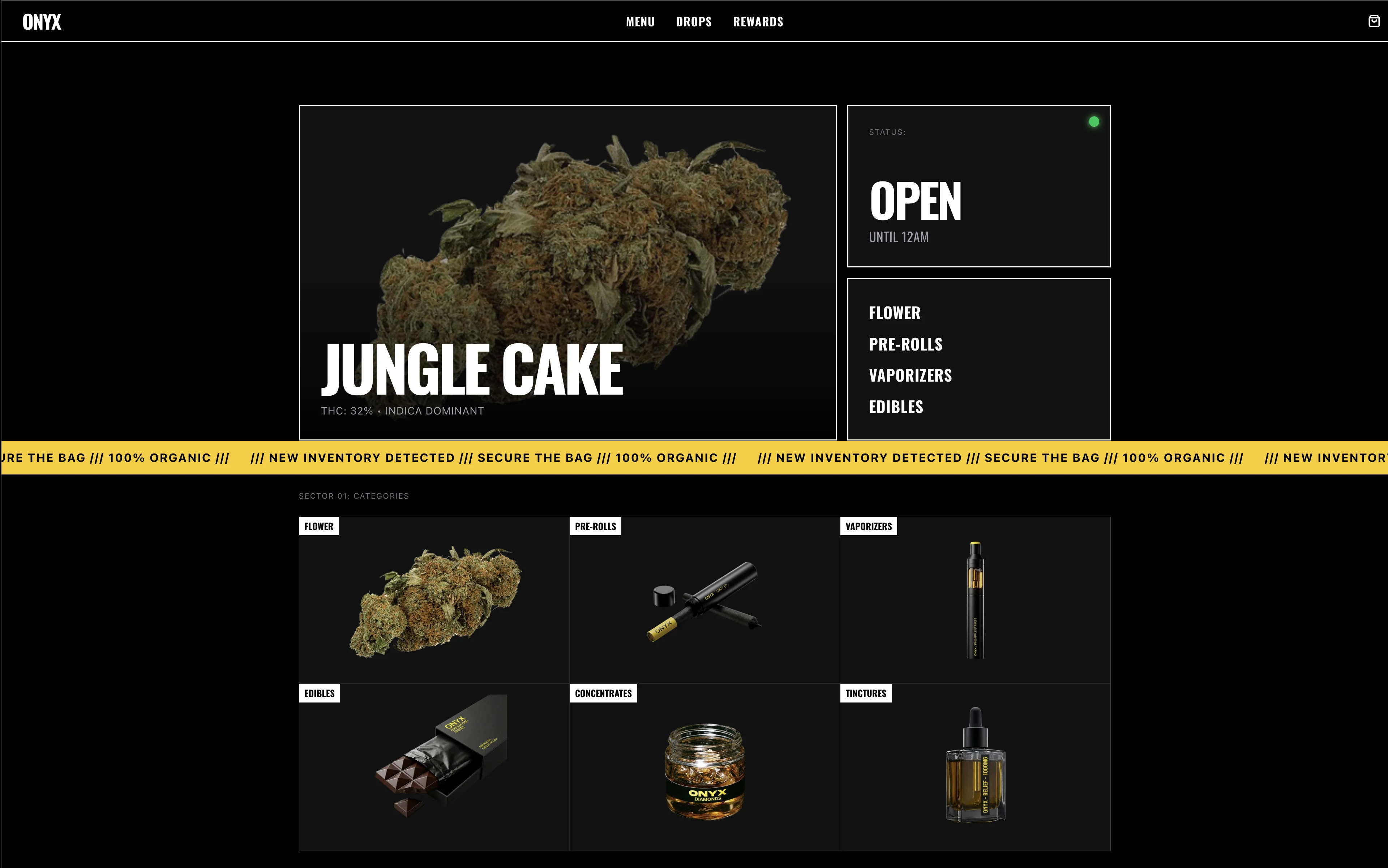
Most dispensary sites look the same—green leaves, generic layouts, forgettable. Onyx wanted to feel like a high-end streetwear brand, not a headshop.
The Solution
We leaned into brutalism. Stark black and white. Bold Oswald typography. Zero clutter. The result is a bold, unapologetic design that commands attention and builds instant credibility.
Visual Identity
Aa
Aa Bb Cc Dd Ee Ff Gg Hh Ii Jj Kk Ll Mm Nn Oo Pp Qq Rr Ss Tt Uu Vv Ww Xx Yy Zz
Typeface Family
Oswald
+ Inter
+ Inter
#000000
#333333
#FACC15
SYSTEM ACTIVE
Mobile Menu
ONYX
SYS://LICENSE_MR28172
© 2024 ONYX_DISPENSARY
NEXT CASE STUDY
VERDE MEDICAL
View Case Study
